Hello everyone! This is Nastya, founder of the international digital agency AZ Agency. Today, we’re excited to share our experience working on one of the most creative and atmospheric projects — Eden Garden Jewelry. This project was developed in collaboration with the marketing agency Radchenko & Sharipova (https://radchenkosharipova.com/).
This is not just an online store; it’s a whole world inspired by nature, magic, and fantasy. Our task was to create a design that conveys this atmosphere and immerses users in an enchanted forest filled with mystery and magic.
About the project
Eden Garden Jewelry is an online store specializing in creating unique, unconventional rings with a fantasy aesthetic, but the brand is primarily focused on botanical nature aesthetics. Research revealed that the rings created by this brand attract not only nature lovers but also those who feel a connection to the magical world and are often part of various subcultures.
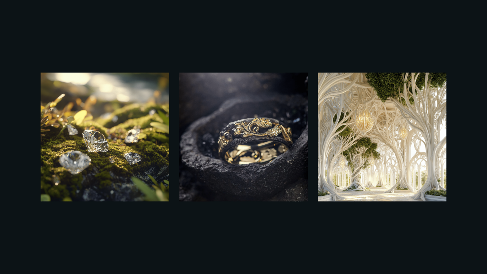
The brand appeals to customers who are looking for more than just jewelry, but a symbol that fits perfectly into their magical and natural world. The product range includes wedding and engagement rings with delicate botanical details, natural textures, and unique stones. The website design concept is a journey through a magical forest, where each element immerses the user in an atmosphere tied to nature and fantasy.
Design metaphor: A journey through the forest
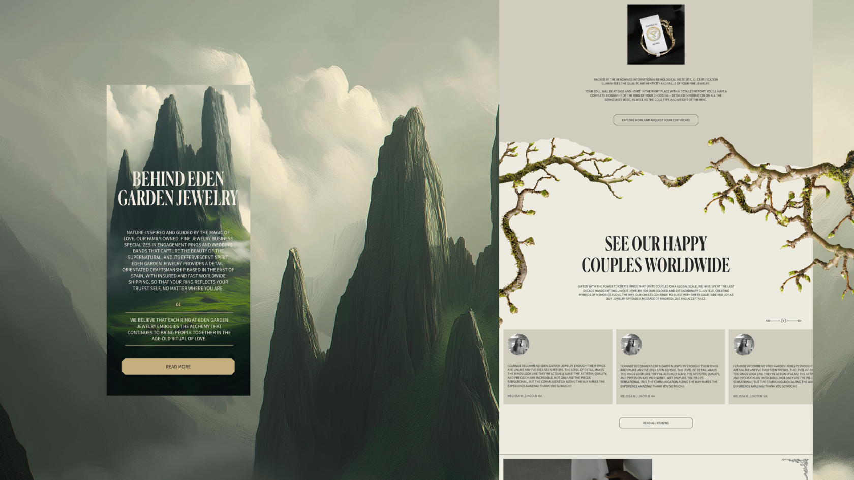
The main idea behind the site design was to create an environment in which shoppers could feel like part of a magical world. Each ring featured in the store is not just a piece of jewelry, but a part of a fantastical forest filled with the essence of ancient druids and elves. The overall design was inspired by natural motifs — forests, stones, moss. All elements, including fonts and color schemes, reflect a connection to nature.
Fonts and colors: Antiqua and natural shades
When selecting the fonts, it was important to maintain the nature theme. An antique serif font, Canela Condensed Trial, was chosen for the headings, while Source Sans 3 was used for text. The color palette of the site avoids bright, saturated colors like pure white or black. Instead, it uses warm, natural tones: dark earthy, sandy, and light grey shades, creating a soft, cozy atmosphere.
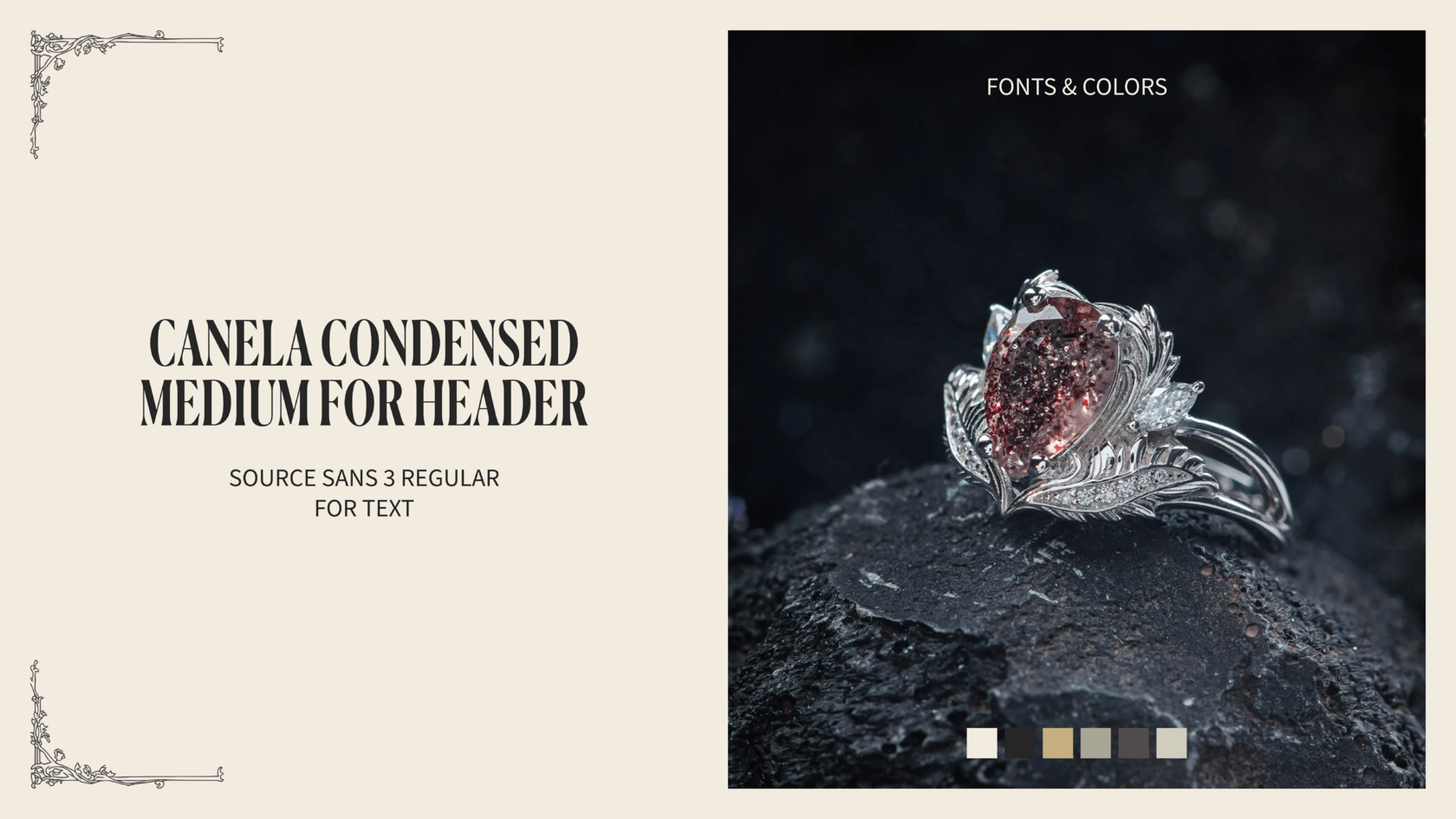
The background of the site is in warm hues with soft, natural tones. These colors support the idea of connecting with nature, creating a visual balance between content and the background.
Animations and dynamics: Immersion into the world of fantasy
One of the key elements of the design is the use of animations on the homepage. The main page features dynamic animations, such as “hands” that appear on the screen, creating an effect of immersion into the brand’s atmosphere. These hands are not just decorative but carry deep symbolic meaning. They symbolize the connection between humans and nature, reflecting a careful interaction with materials and attention to detail, while also associating with the art of jewelry craftsmanship. They emphasize the uniqueness of the jewelry, showing that each ring is not just an accessory, but a personal artifact of the owner. Visually, these animations fit seamlessly into the fantasy atmosphere of the site, making it feel more alive. Furthermore, all hand animations are deliberately gender-neutral, which is important for the brand, as it caters to a broad audience and avoids gender-specific associations.
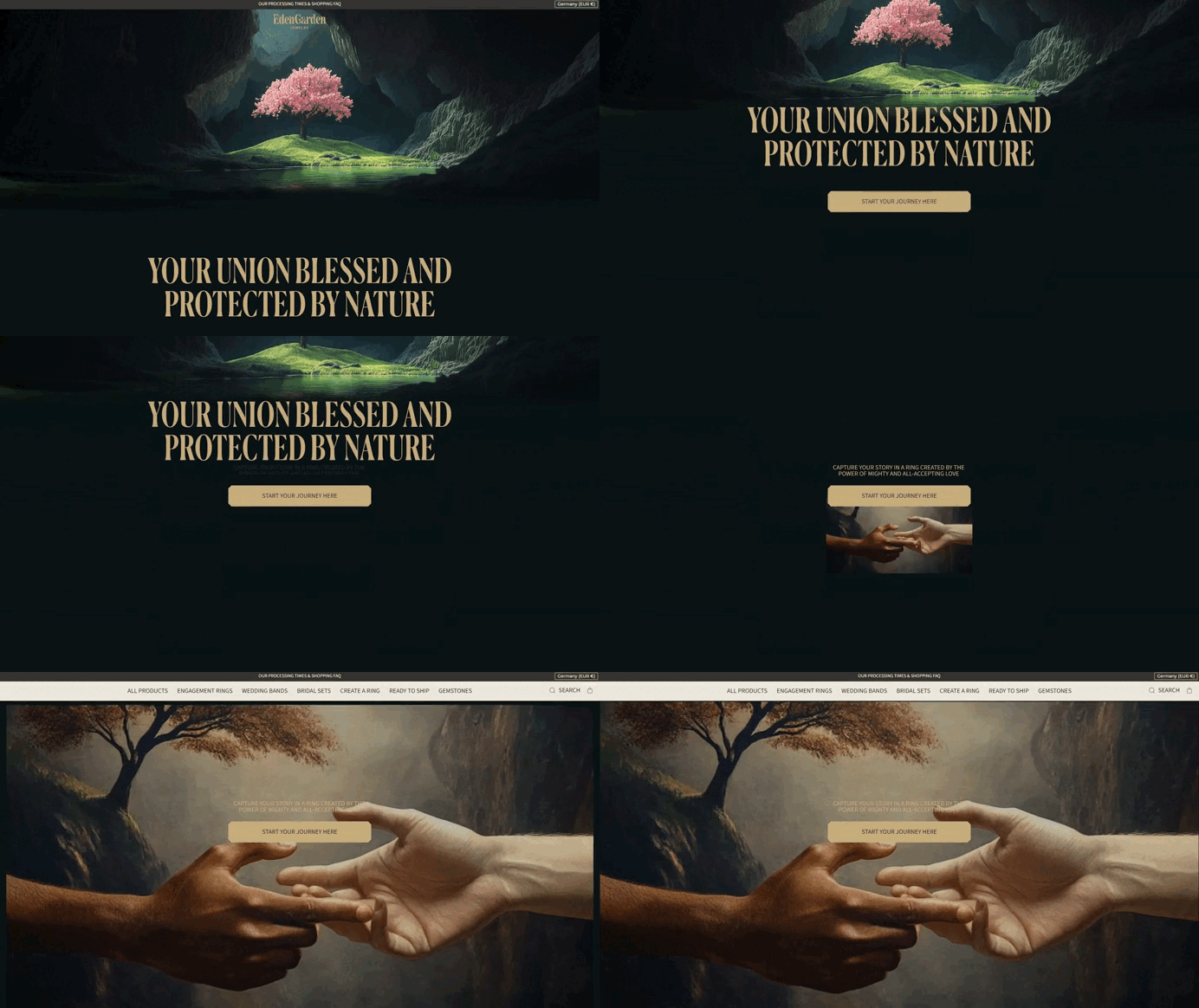
The animation is done with attention to detail, helping to create the feeling of immersion into a world of magic and nature. This applies not only to the homepage but also to other sections, such as the mountain animation and the titles. Even transitions between sections use effects reminiscent of torn paper, while branches and natural elements enhance the atmosphere.
Photos and catalog: The magic of rings
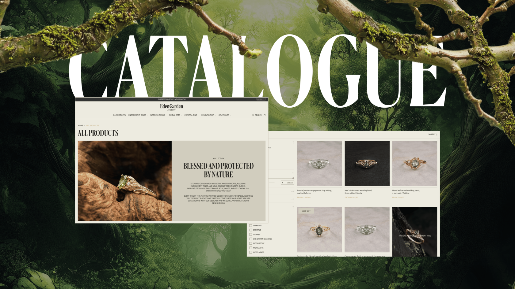
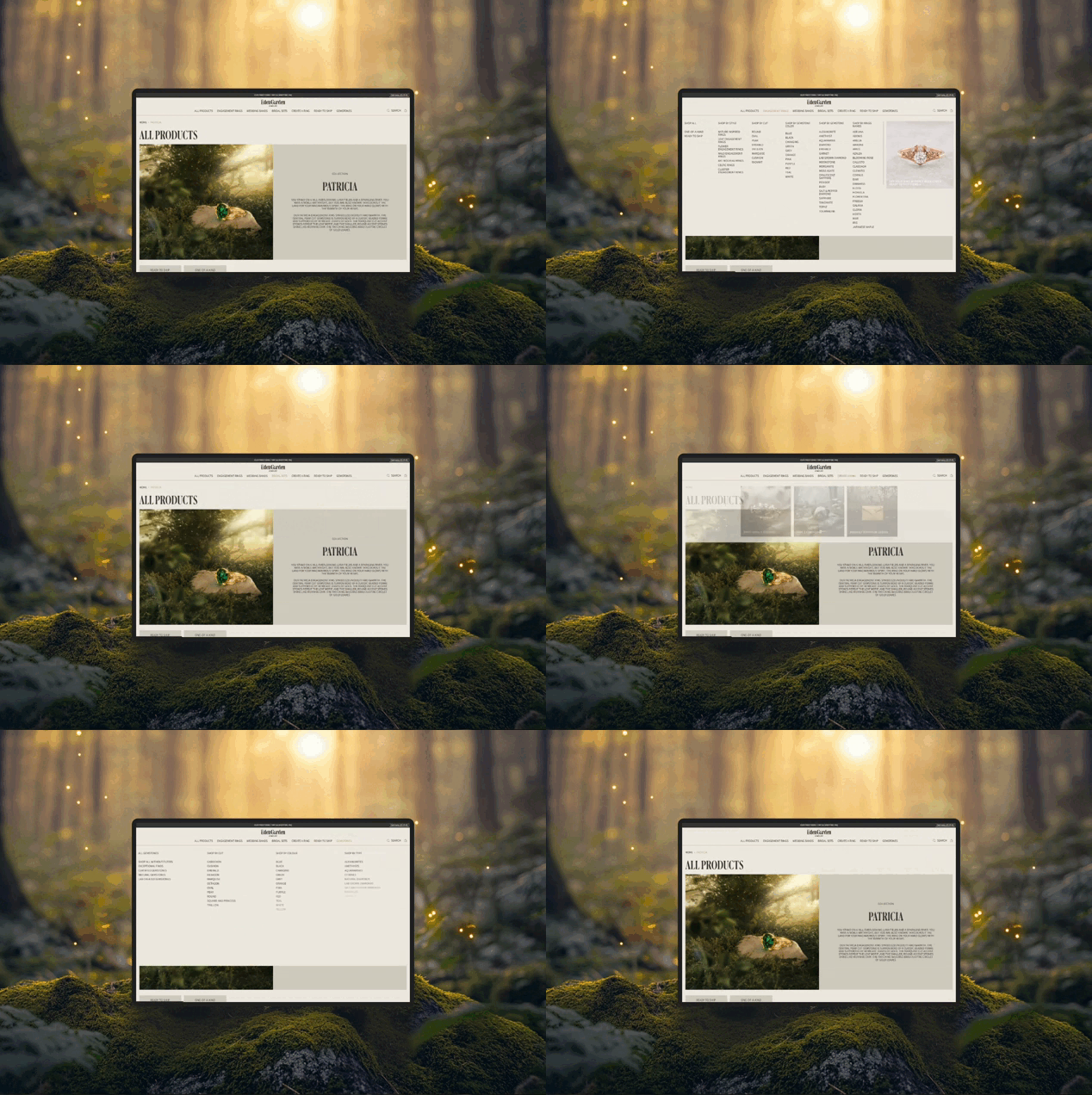
A lot of attention was also paid to the photos of the rings. To maintain the integrity of the concept, they were completely redesigned to match a unified style, ensuring that each piece of jewelry looked not just like a product but as part of a grand magical world. The marketing agency conducted a special photo shoot in England to create images that align with the website’s aesthetics and seamlessly fit into its concept. In the catalog, the rings are presented on alternating light and dark backgrounds, with only natural shades used. For example, the background may be beige, gray, or have a stone texture, highlighting the brand’s natural aesthetic and reinforcing the magical forest atmosphere.
The store catalog is a key page. Since the store’s assortment is vast, it was important to think through convenient filters and transitions between products. The collections available on the site are diverse, so we carefully considered the structure of transitions to make it easy for customers to find the items they need and enjoy the selection process.
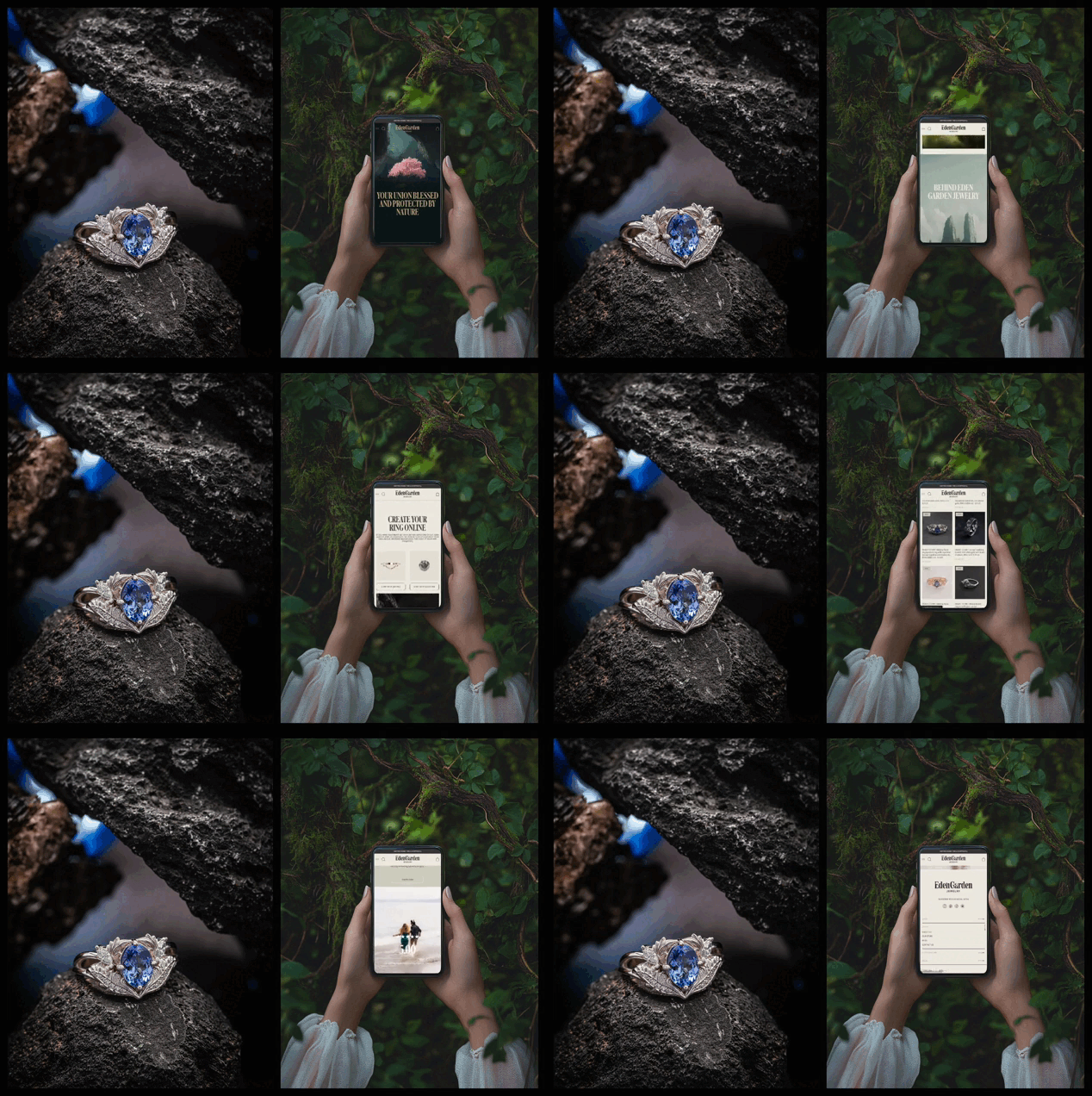
In addition to ready-made items, Eden Garden Jewelry offers a custom ring service. We integrated this feature into several key sections of the site — the homepage and product pages. Users can not only select ready-made jewelry but also create their own unique ring by combining settings and stones in a special section.
For customization, there are two separate sections: one for choosing settings and the other for selecting stones. If the models presented on the site don’t match the customer’s wishes, they can create a piece of jewelry according to their preferences. The custom ring builder is structured like a designer, where the user first chooses a setting and then picks the perfect stone to match.
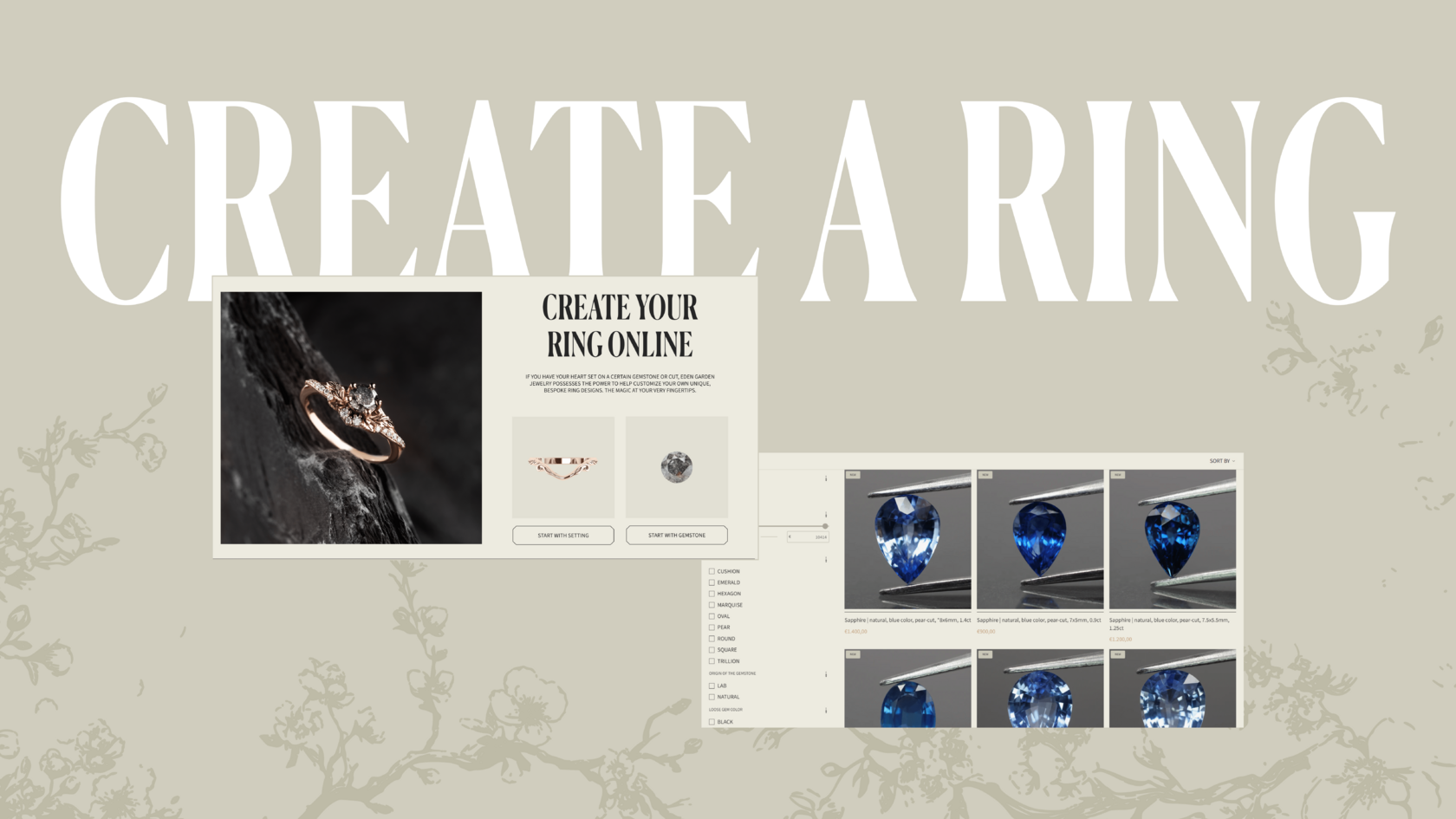
Thus, the store’s offerings are not limited to just ready-made models — every customer has the opportunity to create a piece that reflects their personal style and preferences.
About us page: Heroes of the magical world
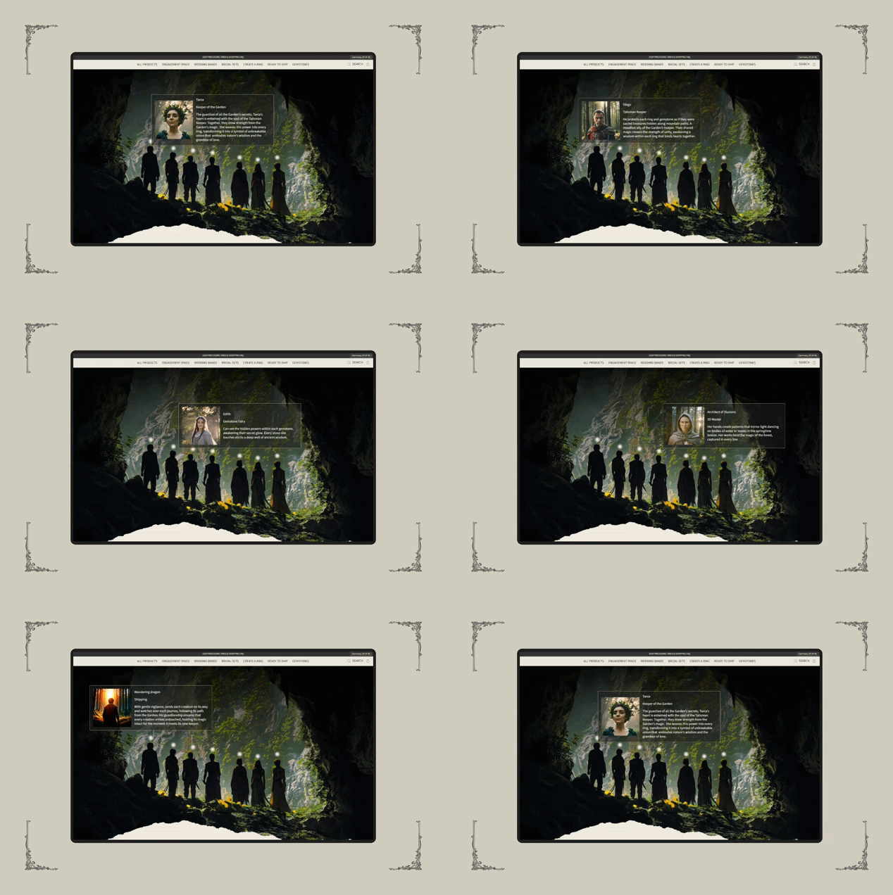
The “About Us” page serves to create depth and a connection to the store’s story. It is designed in the same magical style as the rest of the site. When opening this page, the user is presented with the company’s history against a backdrop of forest motifs. For each team member, there is an interactive narrative that recreates a fantasy atmosphere, inspired by video games, making the site not only user-friendly but also engaging for visitors.
The secret lies in the details: Neural networks and individuality
Not only the main elements of the design, but also the smallest details were carefully crafted with attention to uniqueness. For example, the frames surrounding the collections were created using neural networks, which allowed for original elements that highlight the magical style. Neural networks were also used to create branches and other natural elements, adding extra atmosphere and uniqueness to the site.
Customization using Shopify template code
It’s important to note that during the project, we worked with a Shopify template that was customized with code. While this imposed certain limitations, we were able to shape the design to fit the chosen concept and ensure ease of use. Within the selected template, we completely changed its appearance and, to create custom animations and original designs, we rewrote code on several pages, such as the homepage and “About Us,” to give the site a unique character. Our team of specialists, including developers, was able to fully adapt the template and make it distinctive, highlighting the brand’s identity. All blocks were adapted, resulting in a harmonious and functional solution.
Conclusion
The redesign of this online store stands as a successful example of how creativity and functionality can be combined to create a site that is not only visually attractive but also user-friendly. Inspired by nature and fantasy motifs, the website immerses customers in a world of magic and beauty, where each ring tells its own story.
Link to the site: https://edengardenjewelry.com/
